

Project Vision:
You n’ You is a dedicated mobile app that emphasizes diversity and accessibility, targeting busy users seeking to book verified wedding venues that meet their needs.
Challenge:
Create a wedding venue app that efficiently finds venues that showcase diversity, inclusion, and acceptance to individuals with specific needs.
(Side note: This is my first UX design project for the Google UX Certificate course.)
UX - Research
Competitive Analysis
I completed a competitive audit of four similar products to reveal their weaknesses and turn them into opportunities.
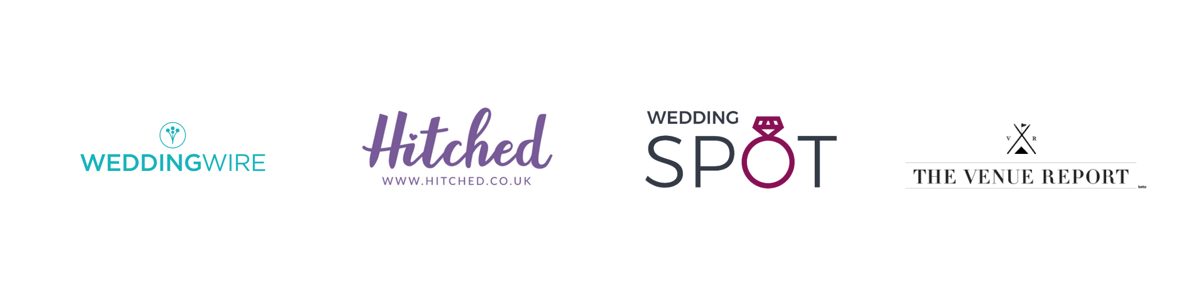
Weakness:
Lack of sorting option
Lack of information about accessibility
Lack of visible diversity
Opportunities:
Create “Sort by” option
Verification for accessibility
Visibility of diversity from venues.
Conduct Interviews
I Interviewed five people to determine user types and developed personas via journey mapping.
Primary User: People experience anxiety and stress when booking a wedding venue, especially those seeking specific accommodations.
Secondary User: Busy people want to use technology to complete tasks independently and need verification to book a venue that meets their needs confidently.
Primary User: Kai

Age: 38 // Occupation: Project Manager
Problem Statement: Kai is a busy project manager who needs an easy-to-use wedding app to book an LGBTQ-inclusive wedding venue. His hearing impairment makes him uncomfortable making phone calls to secure bookings.

Pain Points
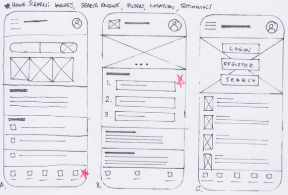
Design: Paper Wireframe
I quickly generated five paper wireframes to address pain points. The prioritized three stars are:
1. Navigation Bar // 2. Steps and procedures // 3. Carousel showcasing diversity and inclusion.

Digital Wireframe
Developed Lo-fi wireframes with consideration for diversity and accessibility.


Lo-Fi Prototype
Created and used LoFi Prototype for the usability study

Usability Study —> Refining the Design

Insight: People need a more intuitive way to search for wedding venues.
Minimalist homepage for ease of navigation
Single-click to begin search
A more defined button labeled: “Search Venue”
Mock-Up:
I applied Gestalt’s Principles (similarity, proximity) and hierarchy to improve and simplify communication.
Put titles above pictures on the left-side margin
Group larger inclusivity icon; pair reviews and costs
Add default: “Sort By”

Insight: People need more visibility and clarity of functions
Put “Location” in a common region
Make Calendar expandable
Move “Apply” to the top and make Navigation Bar visible

Accessibility
Design considerations
Improved access to vision-impaired users by updating better color contrast to meet WCAG Level AA/AAA standards.

User Experience Consideration
I added accessibility icons and inclusive imagery throughout the main user path to increase visibility and accessibility to reach a wider audience.

Design: Prototype

Takeaway
What I learned:
User group research and usability studies strongly influence the design process.
Empathy mapping and accounting for accessibility improve the design enhancing the user experiences for all users.
Impact:
Designing your wedding is personal, and the You n’ You wedding app considers edge case users and makes them feel included and visible.
A quote from one user: “It’s easy. Everything I needed to know appeared on each screen.”